Greyscale
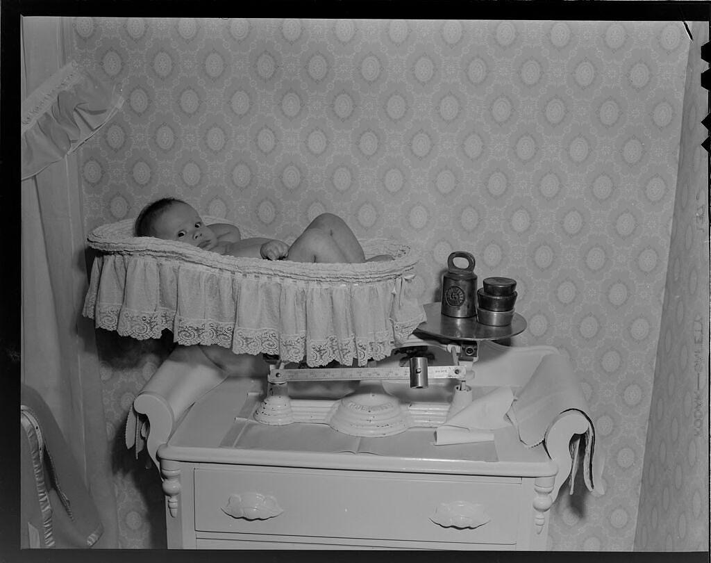
Lucian and Mary Brown: Untitled [baby on scale] (1955)
"My life seems both harder and better when lived in Greyscale."
Our world was never given to present itself in oversimplified blacks and whites. Every dichotomy amounts to a lie, an oversimplification intended to amplify difference rather than similarity. Likewise, our world was never given to present itself in garish colors as if it were a Vincente Minnelli movie, another oversimplification intended to downplay difference and dazzle the eye—more entertainment than information.
Real life, if I even dare speak of reality in these times, lies somewhere between these two common extremes, in what I might refer to as the Greyscale, where shadow and light highlight both similarity and difference, and distracting dazzle seems more properly muted. We seem to have evolved into a species that expects, first and foremost, to be entertained, and both Black & White’s controversy and Kodachrome’s garishness seem well-suited to that purpose. Both mediums seem to hide information to amplify the potential for entertainment. Both seem like distractions.
Greyscale seems sober in comparison. It’s maintaining subtle information. It often seems determined to complicate what could have been rendered as simple cartoons. The blemish on the fruit remains. The incongruities of textures become obvious. With details retained, conclusions come more begrudgingly. Choices must be more deliberately made when decoding whatever I’m seeing. I can see the influence of opposites on composites, how insignificant details influence overall impressions. These features seem to better represent our actual visual experience than even the sharpest full-color or purely black-and-white renderings might. We’ve grown to mistake the visual domain as being somehow exempt from the allegorical and the metaphorical, when it is easily as impressionistic as the spoken word or any abstract painting. I blame television for eroding these distinctions.
Since I turned off the Kodachrome on my iPhone, the “real” world has started popping into sharper focus. It seems as though I’m making better distinctions between representative and primary experience. A representative experience might be any experience rendered from its native context into another. Every video contains only representative experience, never the actual. When I look out my window, that’s a primary experience. The differences between representative and primary experience seem to erode with the constant presence of representative experiences. With the easy access my iPhone provides, it might be that I have been registering more representative experiences per day than primary ones, even though a primary experience always accompanies every representative one, though it often goes unnoticed. Who pays attention to what they’re doing with their hands when they’re watching a TikTok video? Such representative experiences can become absolutely all consuming, though overwhelming in ways we’re unlikely to even notice.
One author referred to this phenomenon as Amusing Ourselves to Death, though both the associated amusement and the death seem tiny and utterly inconsequential. When trolling for a tiny dopamine hit, our attention diffuses. We might essentially lose consciousness, or enter an altered conscious state almost indistinguishable from unconsciousness. Into a world seemingly without pain or confusion, the representations we experience there effectively work as replacements. Replacements for consciousness. Replacements for experience. Replacements for life.
Perhaps I overstate my case here, for I am a biased witness. I have done no objective analysis on this subject, and I speculate about whatever happens when I distract myself with Vincente Minnelli renderings of otherwise perfectly, normally confusing happenings. These small amusements almost always draw conclusions for me, saving me the trouble of noodling through the inherent ambiguity to conclude something for myself. But then, the inherent ambiguities often get rendered out of the representative experiences. I have come to ache for more Greyscale portraits. Less dichotomy. More ambiguity. Less flashy color, please.
I remain sorely tempted to turn the color back on, to abandon this probably foolhardy enquiry into my scrolling habits. I feel the obsession battling with my reason. I sense opportunities lost. I feel somewhat abandoned without my little visual morphine pump taking off the edge. In this season especially, looking out the window finds me experiencing Greyscale, too. The sky rarely seems blue. The ground, barely green. The trees barren. This accurately, if allegorically, represents my experience with my iPhone’s Greyscale turned on. It forces me to more deeply consider whatever I’m viewing. The meaning’s no longer effectively conveyed in garish colors. I notice myself drawing different conclusions than the authors of my representative experiences seemed to have intended. Maybe I’m no longer so easily manipulated if my world retains its natural ambiguities. My life seems both harder and better when lived in Greyscale.
©2025 by David A. Schmaltz - all rights reserved

Good For A Goose

Decency (90)
Decency Unscrolling (1)
EndDays (92)
Exiled (90)
Fambly (93)
FollowingChapters (93)
Grace (92)
Humor (2)
iAlogue (1)
Letters to the Editor (1)
NextWorld (91)
Personal (18)
Prosperity (24)
Steam Festival (4)
Unscrolling (89)
Vaporized (6)
Work (16)
June 2026
May 2026
April 2026
March 2026
February 2026
January 2026
December 2025
November 2025
October 2025
September 2025
August 2025
July 2025
June 2025
May 2025
April 2025
March 2025
February 2025
January 2025
December 2024
November 2024
October 2024
September 2024
August 2024
July 2024
June 2024
May 2024
April 2024
March 2024
November 2006
October 2006
September 2006
August 2006
July 2006
June 2006
May 2006
April 2006
March 2006
February 2006
January 2006